…but near things are more related than distant things.” – that’s Tobler’s First Law of Geography.
I just ticked another box on my sabbatical proposal by completing an online course, Maps and the Geospatial Revolution. It was a five week MOOC (Massive Open Online Course), given by The Pennsylvania State University, on Coursera.

I enjoyed the experience. Since the course was developed within a Geography Department, the focus was on how maps support geospatial data. The course was very basic, and I didn’t need any previous knowledge to take it. We learned geography vocabulary and how geographers work with data. We looked at a lot of maps, of course. We used ESRI ArcGIS, an online mapping platform, to plot data and learn a bit about creating and analyzing web maps. We learned where to find data to import and how to find its source to understand more about it. Data, on its own, as in a spread sheet, is hard to decipher. When you plot points on a map, you can begin to tell a story.
Where does data comes from? It comes from just about everywhere, whether it’s captured electronically or by hand. Images are considered data. Satellites take pictures and produce geotagged raster images, as you see with Google or Bing maps. People create data, and a lot of it can be used for free and found on the ESRI ArcGIS site, government sites or other data repositories.
The most radical development in recent years is the crowdsourced map. You may have heard of Open Street Map, a free mapping platform that anyone can add information to. Regular folks like you and me can add geographic information (data) to online maps. You can add images, locations, streets, descriptions, and warnings. Crowdsourced maps can help everyone from hikers plotting the best recreational hikes to first responders in disaster areas.

An example of a community mapping project was where the citizens of Kibera, Nairobi worked with geographers to map their community. They created a street map that showed where to buy food, where to get medical care, find drinking water and noted areas that may not be very safe. A well made map can empower people. Here is one of the videos from the course about the process: Mapping Power to the People.

You can also map your own personal data. For almost two years, I’ve been tracking my movements on my phone, with FrickBits. I’ve recently started using Open Paths too. Both log your location, or should I say, the location of your phone. I was able to map the data from my phone for an overall picture of where I’ve been. Open Paths supplies altitude data. By changing the size of the circle to reflect altitude (larger dots = higher altitude), you can see where the higher points around London are. Here’s every where I had been in London. Please note, I did not spend as much time in the Thames River as the data presents. This type of collection is not as accurate as your fitness app!

In the course, we looked at a lot of cool maps. I liked this viewshed map from San Francisco. You’ll find it handy when you buy property in the city – click anywhere on this map and you can see what the view from your new house will be!
The map below was also fun. ESRI has made a series of weather maps with real time information. To enhance the minute to minute information, they have included social media on the map, using keywords, like “tornado” or “rain” or “ice”. The idea behind this was that citizens can get up-to-date localized information that could save them from driving to the wrong place or to know when and where to take cover from a storm. Take a look at some of the tweets and other social media here. It’s kind of funny. Posts of songs about “rain” and posts about “ice” cream are mixed in with pictures of snow piled on patio furniture or flooded streets.

The last section of the course was about design. The rules are the same for graphic design – start by asking who your audience is, simple is better, create a layout hierarchy and use decent typography. One section was named “Rainbows kill people, so stop using them on maps”. Mapping software loves a good rainbow palette, correct? You see this on the tv weather report. The problem with the rainbow is that no color carries more importance than the next. Yellow may appear brighter and may seem more important, but quick, which color denotes “more than” – red or blue? You have to take the time to learn what the map maker intended. With a single color that fades to white, you intuitively know that 100% color and white are at opposite ends of the scale. Just another reason to stay away from those default palettes (of any kind) that “come with” your software.

We only scratched the surface of this immense topic. Yes, maps were included, but the focus was on the geospatial data. Each week there was a series of short readings and videos, and a quiz (I passed them all). A weekly discussion forum was optional, but I posted to that every week.
Since it was a MOOC, it was a bit of an anonymous experience. I don’t know how many people were actually participating in the course, but it seemed only about 15-20 regularly posted in the forums. There was very little back and forth with other students, which was a little disappointing. If you posted late, you were not penalized for missing deadlines and you have six months beyond the end date of the course to finish the work. Our final assignment – featured in the next post – need to be graded by five classmates. I’m still waiting for that to happen….
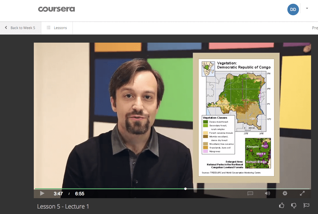 So thank you, Dr Anthony Robinson (and his colleagues), from the Geography Department at The Pennsylvania State University, for creating this course. It is the closest thing I could find to a “making maps” course. Robinson was the person in the videos and he was pretty funny. The entire class was fun and entertaining. If you are interested, you can take the five week course for free. There’s probably one starting again soon.
7/8/2017 – I passed!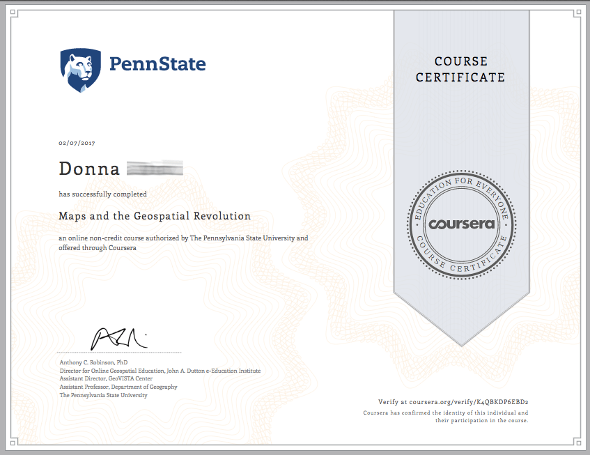
You must be logged in to post a comment.